Introducing the DIL Observatory
Meta description: Introducing the DIL Observatory: a free map-based intelligence dashboard for OSINT, threat monitoring, breach signals, and cyber risk context.
The first thing a cyber map gets wrong is also the thing that makes it useful: geography. Ransomware operators do not “attack Italy” or “attack Brazil” in the same way a storm hits a coastline. They compromise VPN appliances, identity providers, exposed RDP services, SaaS tenants, supply-chain software, and managed service providers. Yet the moment a breach claim, vulnerability campaign, sanctions update, data leak, or hacktivist operation is placed on a map, analysts gain a different kind of visibility: not attribution certainty, but operational context.
That context is usually scattered. An extortion claim appears on a leak site. A CVE is added to CISA KEV. A Telegram channel claims responsibility for website defacements against a ministry. A sector regulator issues a new reporting requirement. A cryptocurrency market move changes the economics of underground services. Each signal is individually useful; the problem is that analysts rarely see them together unless they already have access to multiple paid platforms, internal collection pipelines, or a mature threat intelligence team.
community.digintlab.com exists to close part of that gap. The DIL Observatory is a free community dashboard from Digital Intelligence Lab that gives users a live, map-based view of recent activity across the digital realm. It centralizes signals from extortion, breaches, underground activity, threat infrastructure, vulnerability intelligence, regulatory developments, geopolitical risk, and broader digital risk indicators in one place.
This is not meant to replace a finished intelligence product, a SIEM, an EDR console, or an incident response workflow. Its value is earlier in the analytical chain: helping practitioners see where signals are clustering, which sectors appear in recent activity, what kinds of events are emerging, and how digital risk is intersecting with geography, industry, and public reporting. For analysts, researchers, journalists, students, and security leaders, that visibility matters because the first useful question is often not “who did this?” but “what pattern am I failing to see?”
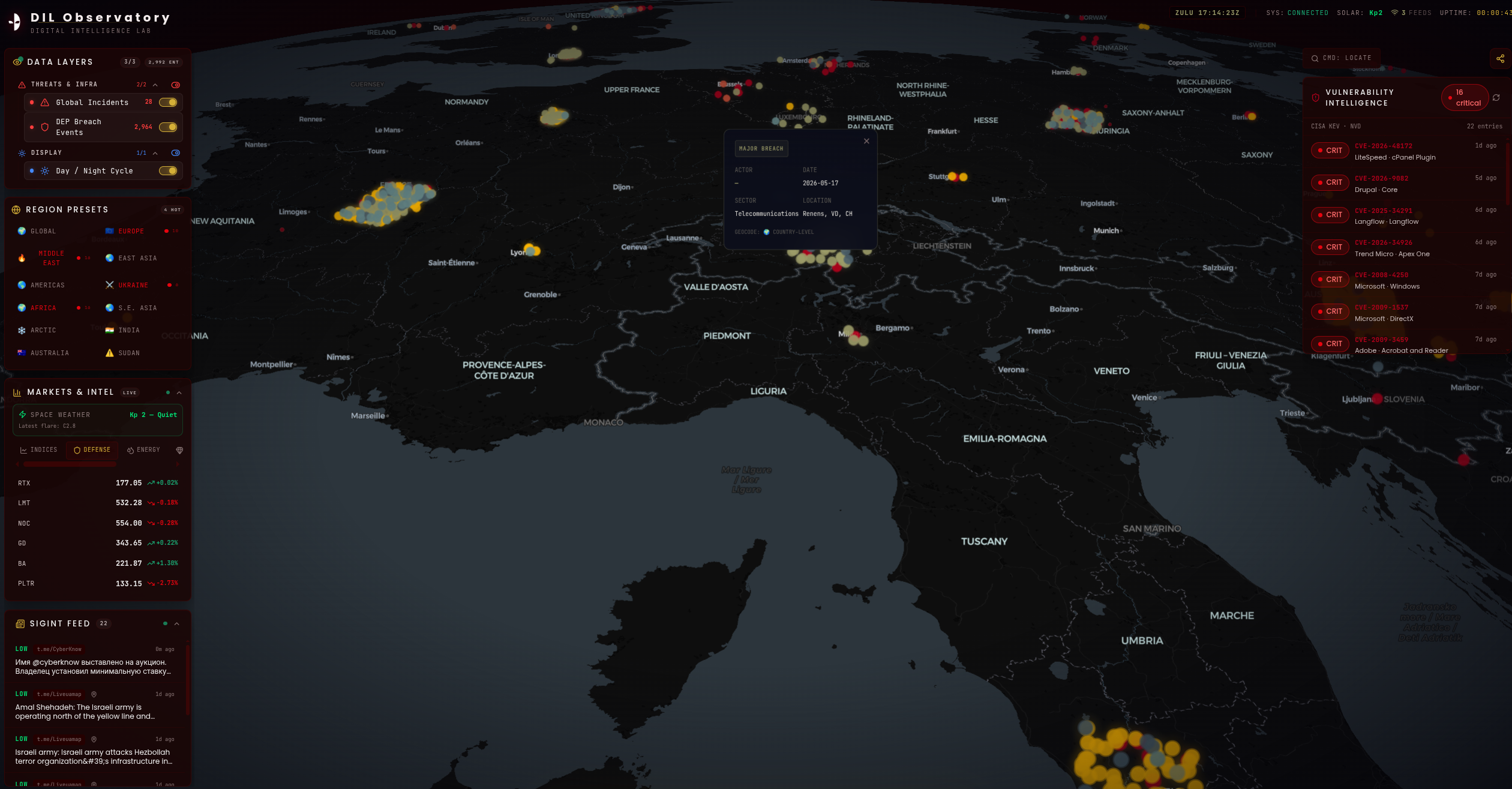
Figure. DIL Observatory
A map is not a gimmick when the question is context
Security teams are right to be skeptical of threat maps. Many are visual theater: animated lines, glowing arcs, fake packet storms, and little analytical value. The common assumption is that maps are for executives and flat tables are for analysts. That assumption is incomplete. A map is weak when it pretends to show packet-level truth. It becomes useful when it is honest about what it represents: observed digital events with location metadata, confidence levels, affected sectors, timestamps, and source-derived context.
The DIL Observatory is built around that more defensible model. Users can inspect events directly on a global interactive map and review details such as actor, date, sector, location, and geocoding level where available. That last field matters. A breach claim tied to a company headquarters is not the same as an intrusion into a regional subsidiary, and neither is the same as a victim’s customer base. A serious map must expose that ambiguity rather than hide it behind a clean pin.
Consider the difference between a ransomware leak-site claim against a European manufacturer and a vulnerability campaign exploiting edge devices across multiple regions. A flat feed may show both as “critical.” On a map, the analyst can start asking better questions. Are claims clustering in industrial regions? Are events concentrated around countries with new regulatory pressure? Is a spike in activity aligned with known exploitation of CitrixBleed, tracked as CVE-2023-4966, or with mass exploitation of MOVEit Transfer through CVE-2023-34362 by Cl0p? The map does not answer those questions alone, but it makes them visible faster.
The trade-off is precision. Digital events often have messy geography. Cloud infrastructure may be hosted in one country, the victim incorporated in another, the affected users distributed globally, and the threat actor operating through rented infrastructure elsewhere. The Observatory’s map should be treated as an analytical interface, not a forensic record. The value comes from combining map-based discovery with event inspection, feed context, and analyst judgment.
For practitioners, the implication is simple: do not use a map to prove attribution or impact. Use it to detect concentration, compare event types, and decide what deserves deeper collection. A good dashboard shortens the distance between signal and question.
Why centralizing extortion, breach, vulnerability, and underground signals matters
Most teams still treat digital risk domains as separate queues. Vulnerability management tracks CVEs. Threat intelligence tracks actor activity. The SOC watches detections. Legal tracks breach notifications. GRC tracks regulatory change. The underground economy gets handled by whoever has dark web access or a paid feed. That separation is organizationally convenient, but attackers do not operate inside those boundaries.
The MOVEit campaign showed why this matters. Cl0p did not need to encrypt thousands of endpoints to create enterprise-scale pressure. The group exploited a managed file transfer vulnerability, stole data, and turned disclosure pressure into the primary extortion mechanism. A traditional ransomware dashboard focused only on encryption events would have underrepresented the campaign. A pure vulnerability feed would have lacked victimology and extortion context. A breach feed alone would have missed the exploitation pattern. The useful view is the one that lets the analyst see vulnerability intelligence, breach exposure, sector distribution, and extortion behavior together.
The same logic applies to edge-device exploitation. Public reporting has tied Ivanti Connect Secure exploitation, including CVE-2023-46805 and CVE-2024-21887, to espionage activity associated with UNC5221. CitrixBleed exploitation affected organizations before many had finished asset discovery and patch validation. PAN-OS CVE-2024-3400 created urgent exposure questions for organizations running GlobalProtect gateways. In each case, vulnerability severity was only one part of the intelligence problem. The operational questions were sharper: which sectors are being hit, where are exposed organizations concentrated, which actors or intrusion sets are mentioned in reporting, and are extortion or data leak signals appearing afterward?
The DIL Observatory is designed to bring these domains into a shared visual workspace. Its event layers and intelligence feeds allow users to move across categories such as extortion, data breaches, vandalism, underground activity, threat infrastructure, vulnerabilities, regulatory developments, and geopolitical risk. That matters because the relationship between these domains is often the story. A vulnerability becomes a campaign. A campaign becomes an extortion wave. An extortion wave becomes a regulatory disclosure problem. A geopolitical event changes targeting patterns against media, energy, transport, or public administration.
There is friction in centralization. Mixed-source intelligence creates noise, uneven confidence, duplicate reporting, and source bias. A Telegram claim is not the same evidentiary class as a regulator notice or a confirmed leak-site publication. A vulnerability alert is not an incident. A market indicator is context, not causation. The Observatory’s value depends on keeping these distinctions visible enough that users can explore without flattening everything into a single “risk score.”
The forward-looking point is that threat monitoring is moving away from single-domain feeds. The teams that respond fastest are not the teams with the longest lists of indicators; they are the teams that recognize when independent signals begin to converge.
What the Observatory gives analysts that raw feeds do not
Raw feeds are efficient for machines and exhausting for humans. A CSV of breach claims, CVE updates, actor aliases, sectors, regions, and timestamps can be complete and still fail to create understanding. Analysts need a way to move between macro patterns and individual evidence without losing the chain of reasoning. That is where an interactive intelligence dashboard becomes useful.
From community.digintlab.com, users can explore recent events through a map interface enriched with event layers, regional presets, intelligence feeds, vulnerability updates, and contextual indicators. The experience is not only “show me everything.” A better workflow is “show me what changed in this region,” “show me extortion activity affecting this sector,” or “show me whether recent vulnerability intelligence overlaps with visible breach or underground signals.”
For example, a SOC lead at a logistics company may care less about global ransomware volume and more about whether transportation and warehousing entities are appearing in recent extortion claims across neighboring countries. A journalist may need to understand whether hacktivist vandalism is isolated or part of a wider campaign around an election or conflict. A student may use the dashboard to learn how vulnerability disclosure, exploitation reporting, and victim claims differ in timing and evidentiary quality. A CISO may use it as a situational awareness layer during board preparation, not as proof that the organization is or is not exposed.
The key advantage is inspection. Each event can be opened and reviewed with structured details such as actor, date, sector, location, and geocoding level where available. That makes the dashboard more than a colored map. It becomes a starting point for analyst triage: identify the signal, check the context, compare it with other layers, then decide whether to investigate in internal tooling or external sources.
The limitation is that community-facing visibility cannot be the same as a sensitive enterprise intelligence workflow. A free dashboard must balance accessibility with source protection, legal constraints, and responsible presentation. It should not expose victim-sensitive material, raw criminal content, or details that would turn situational awareness into operational enablement for attackers. That restraint is a feature, not a weakness.
For practitioners, the implication is that the Observatory is best used as an awareness and discovery layer. It helps teams see the shape of current digital risk, then move into their own controls, telemetry, vendor portals, ticketing systems, and investigative processes when the signal is relevant.
Where DIL and DEP fit: from community signal to evidence-grade monitoring
Digital Intelligence Lab has a specific connection to this problem because its commercial work is already centered on OSINT-derived cyber risk and ransomware exposure monitoring. DIL’s flagship platform, DEP, the Double Extortion Data Platform, monitors ransomware and extortion actor activity at scale, including breach claims, dark web leak sites, and threat actor telemetry. That background matters because extortion data is one of the hardest categories to normalize without losing operational meaning.
Leak-site monitoring is not just scraping victim names. Groups such as LockBit, BlackCat or ALPHV, Akira, Black Basta, Play, and Cl0p have used different publication patterns, countdown mechanics, naming conventions, mirrors, and pressure tactics. Some claims are recycled. Some victims are subsidiaries. Some posts disappear after negotiation or infrastructure disruption. Some actors inflate impact. Others publish partial evidence that requires careful handling. If a dashboard treats every extortion mention as equivalent, it creates false urgency.
The Observatory benefits from DIL’s operational understanding of that domain while staying open as a community resource. DEP is where enterprise clients can pursue deeper evidence-grade intelligence, exposure assessment, and structured monitoring tied to ransomware and extortion activity. The Observatory, by contrast, gives a broader audience visibility into digital risk signals across multiple domains. The connection is genuine but not identical: the free dashboard helps users observe and orient; DEP supports organizations that need rigorous monitoring, validation, and response workflows around extortion exposure.
That distinction prevents a common product mistake. Not every user needs a paid intelligence platform to ask better questions. Not every enterprise can rely on a free dashboard when legal, regulatory, or incident response consequences are involved. The practical model is layered: open visibility for shared situational awareness, deeper validated intelligence when the risk moves from “interesting” to “actionable.”
The forward-looking observation is that community intelligence spaces will matter more, not less. Attackers already benefit from shared underground infrastructure, brokered access, and public amplification. Defenders need shared visibility too, provided the data is handled with discipline.
The analyst workflow: using the Observatory without over-trusting it
The best way to use the DIL Observatory is to treat it as the first screen in an intelligence workflow, not the last. Start with the map to identify regions, sectors, and event categories that appear active. Inspect individual events for actor, date, sector, location, and geocoding level. Then pivot to internal exposure: do you operate in that region, depend on that sector, run the affected technology, or have third parties that match the pattern?
A practical workflow might look like this:
- Filter the map by region or event type, such as extortion, vulnerability intelligence, underground activity, or regulatory developments.
- Inspect the event details and note the source category, date, sector, actor name, and geocoding confidence where available.
- Compare the signal with internal asset inventory, third-party lists, vulnerability management data, and known business exposure.
- Escalate only when the external signal intersects with internal relevance, such as a technology in use, a critical supplier, a regulated market, or an exposed brand.
- Record the reasoning, not just the alert, so the next analyst can see why the signal mattered or why it was dismissed.
This workflow keeps the dashboard from becoming another noise source. It also avoids a damaging habit in threat intelligence: forwarding external events as internal urgency without proving relevance. A breach claim against a hospital in another region may be situationally useful to a healthcare CISO, but it does not automatically justify emergency action. A CVE exploited in the wild may be critical, but if the affected product is absent from the environment and third-party exposure is limited, the priority changes.
The trade-off is analyst time. Contextual triage takes longer than subscribing to a feed and pushing everything into Slack. But the cost of undifferentiated alerts is higher: fatigue, missed signals, and loss of trust from engineering teams. A map-based observatory should reduce cognitive load by showing relationships, not increase it by creating another stream of disconnected events.
The teams that get the most value will be the ones that connect the Observatory to existing decision points: daily threat briefings, vulnerability prioritization, third-party risk reviews, geopolitical monitoring, sector-specific watchlists, and board-level risk narratives. The dashboard is free; the discipline to use it well is the part each team has to supply.
Conclusion
The DIL Observatory is useful because it does not pretend that digital intelligence is one thing. Extortion, breaches, underground activity, vulnerabilities, infrastructure, regulation, and geopolitical risk are different signal classes, but they increasingly interact. A map-based dashboard gives analysts a way to see those interactions before they harden into incidents, disclosures, or executive surprises.
The important shift is not visual. It is analytical. Instead of treating OSINT as a pile of alerts, the Observatory turns recent digital events into something that can be explored: by region, sector, event type, actor, and context. That makes digital intelligence more accessible without reducing it to generic threat headlines.
Practitioners should use community.digintlab.com as a shared situational awareness layer: watch the map, inspect the evidence, challenge the geocoding, compare signals across domains, and only escalate when external activity intersects with internal exposure. The takeaway is not “trust the dashboard.” The takeaway is “use the dashboard to ask better questions sooner.”
FAQ
How should a threat intelligence team validate events seen in the DIL Observatory?
Treat the Observatory as a discovery layer and validate relevance through your own collection and controls. Check the event category, date, actor, sector, location, and geocoding level before escalating. If the event relates to a vulnerability, compare it with your asset inventory, internet-facing exposure, and patch status rather than reacting to the CVE alone. If it relates to extortion or breach claims, distinguish between a threat actor post, confirmed data publication, media reporting, and regulator confirmation. The analytical value comes from preserving those differences.
Can a map-based dashboard support vulnerability prioritization?
Yes, but only if it is used as context rather than a replacement for vulnerability management. CVSS alone often fails to reflect exploitation pressure, exposed attack surface, sector targeting, and attacker incentives. A map showing vulnerability intelligence alongside breach, extortion, or sector activity can help analysts identify where a CVE is becoming operationally relevant. For example, mass exploitation of MOVEit Transfer or edge-device vulnerabilities carried different urgency than a high-scoring issue with no observed exploitation. The dashboard should inform prioritization, not override asset criticality and exposure data.
What makes underground activity difficult to present in a community dashboard?
Underground activity is noisy, adversarial, and often intentionally misleading. Criminal forum posts, access broker listings, Telegram claims, and leak-site announcements can contain exaggerations, recycled data, fake victims, or partial evidence. A responsible community dashboard has to present the signal without amplifying criminal material or exposing sensitive victim information. That means some detail may be summarized or structured rather than shown in raw form. The trade-off is less raw access, but better safety and usability for a broad audience.
How does Digital Intelligence Lab’s DEP relate to the Observatory?
DEP, Digital Intelligence Lab’s Double Extortion Data Platform, is focused on enterprise-grade monitoring of ransomware and extortion activity, including breach claims, dark web leak sites, and threat actor telemetry. The Observatory provides a broader free community view across digital risk domains, including extortion, breaches, vulnerabilities, underground signals, regulation, and geopolitical context. The relationship is layered: the Observatory helps users observe patterns and orient quickly, while DEP supports organizations that need deeper validation, exposure assessment, and evidence-grade intelligence around extortion risk. That distinction matters when a signal may have legal, regulatory, or incident response consequences.
Who should use the DIL Observatory inside an enterprise?
Threat intelligence teams will get the most direct value because the dashboard supports regional, sector, actor, and event-type discovery. SOC leads can use it to add external context to internal detection trends, especially during active exploitation or sector-focused campaigns. CISOs and security architects can use it for situational awareness during planning, board reporting, and third-party risk discussions. Vulnerability managers can use it as an external pressure signal, especially when CVEs begin to appear alongside exploitation or breach activity. It is also useful for communications and legal teams when regulatory or geopolitical developments affect digital risk exposure.
What is the biggest mistake teams might make with the Observatory?
The biggest mistake is treating every visible event as an internal alert. A public breach claim, vulnerability update, or geopolitical signal is not automatically relevant to your environment. Analysts should ask whether the event intersects with their assets, suppliers, markets, technologies, regulated obligations, or sector exposure. Without that step, the dashboard becomes another source of noise. Used correctly, it helps teams move from broad awareness to targeted investigation faster.